I like the new format for reviews.
Quite aside from the content of the official Twitch stream summaries, I like the layout of them. I don't like the grey font on white background. Everything else about this whole site (except maybe the support page?) is as this one: light font on near-black. This is far more easily readable and the summaries page should be consistent with this colour scheme.
As for the POI discussion.
Elsewhere, someone opined that it was a stretch to call them locations, but I disagree. Locations is all they are, just like points in geometry. Locations of assets without significant content (YET)), same as locations without dimensions.
The stretch is the Points "of Interest" part, as they are placeholders. I'm not alone in finding it regrettable that they couldn't have had the full content ready at the time of placing the assets, but I wouldn't really have expected it to be done all at once. And doing the placement now does, as someone else pointed out, keep players from using the spaces for something that would have to be removed (with many tears() in the meantime.
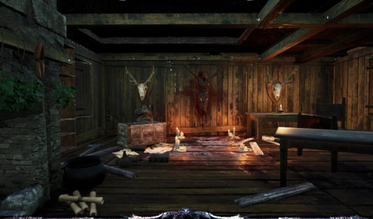
Even so, I like the looks of and the variety of assets pictured in the summary. It was ever so subtly tiresome in MO1 to keep seeing the same rock formations, ruins, etc., everywhere.
They [POIx] are often lack-lustre feeling like they are far short of the scale of the POI. You find a chest next to a prison wagon with several bodies around it.
That reminds me of a scene in The Good, The Bad, & The Ugly. Perhaps it's meant to be an
homage.
And in that chest there is at most a few gold and a pick-axe, and a torch. I am not saying it needs to be a 500g find but perhaps a random skill book or scroll?
This seems like a valid criticism, or at least you are not alone in saying so. Remember barrels from MO1? They had < boxes which had < chests in them. This seems about equivalent to that. Sucks, I guess.
 www.mortalonline2.com

 www.mortalonline2.com

