Greetings dear reader,
In this thread I will put forth several concoctions I have formulated that come in the form of redesigns of the equipment slots in the paperdoll window.
Before we begin, it makes sense to have the current configuration as a reference:
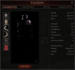
figure 0
Let us begin.
Here are the designs starting with my personal favourite ( and recommended ) :
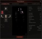
figure 1 - My recommendation
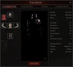
figure 2 - an alternate design
From here onward they are iterations of figure 1, as such they are quite similar.
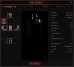
figure 3
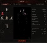
figure 4
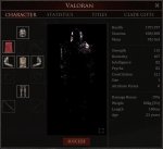
figure 5
All of these designs follow the same ideal, that equipment slots should represent where you would logically expect particular items to be located on the body.
Thus, the amulet is located just below the helmet, with the cape and quiver on either side in my recommended designs.
Now a little explanation on that last part about the quiver:
I am well aware that quivers were often worn on the hip and not on the back, however this depends on how Starvault wants to display the quiver on the body, and the UI can of course be adjusted to fit whatever location they choose to have the quiver.
From a gameplay point of view, it makes sense to have the quiver located directly under the primary weapon slot, as that is where your bow would be. However subjectively and aesthetically I prefer to have it in the shoulder slot for symmetry.
I believe these designs to be far superior to the current in game configuration aesthetically and functionally, however I do realise that this is heavily subjective.
As an additional bonus, I would also suggest a change to the UI when looting a player, to include this new UI configuration next to their inventory for easier less cluttered looting.
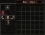
This would make looting a player much easier and more polished, as you know exactly where to look for a particular item. For instance, if you killed someone in a large fight and decide to commit the mortal (pun intended) sin of combat looting, you can quickly retrieve that oghmium helmet you saw him wearing without having to scan over a large jumbled mess of icons like in MO1 and currently MO2.
The same could potentially apply for looting bandits or guards that may drop equipment that conforms to these slots such as swords and pieces of armor.
In case you were wondering, no I have not forgotten about the secondary set of weapon slots from the original design, those slots can easily be added underneath the primary weapon slots. ( I just didn't want to add them for every iteration )
This brings us to the end of my post.
Thank you for reading and I would love to hear any feedback you have on potentially improving these designs, don't be shy.
I only have one favor to ask of you, and that is if you do decide to vote no on the poll, please take the time to leave a comment explaining why.
In this thread I will put forth several concoctions I have formulated that come in the form of redesigns of the equipment slots in the paperdoll window.
Before we begin, it makes sense to have the current configuration as a reference:

figure 0
Let us begin.
Here are the designs starting with my personal favourite ( and recommended ) :

figure 1 - My recommendation

figure 2 - an alternate design
From here onward they are iterations of figure 1, as such they are quite similar.

figure 3

figure 4

figure 5
All of these designs follow the same ideal, that equipment slots should represent where you would logically expect particular items to be located on the body.
Thus, the amulet is located just below the helmet, with the cape and quiver on either side in my recommended designs.
Now a little explanation on that last part about the quiver:
I am well aware that quivers were often worn on the hip and not on the back, however this depends on how Starvault wants to display the quiver on the body, and the UI can of course be adjusted to fit whatever location they choose to have the quiver.
From a gameplay point of view, it makes sense to have the quiver located directly under the primary weapon slot, as that is where your bow would be. However subjectively and aesthetically I prefer to have it in the shoulder slot for symmetry.
I believe these designs to be far superior to the current in game configuration aesthetically and functionally, however I do realise that this is heavily subjective.
As an additional bonus, I would also suggest a change to the UI when looting a player, to include this new UI configuration next to their inventory for easier less cluttered looting.

This would make looting a player much easier and more polished, as you know exactly where to look for a particular item. For instance, if you killed someone in a large fight and decide to commit the mortal (pun intended) sin of combat looting, you can quickly retrieve that oghmium helmet you saw him wearing without having to scan over a large jumbled mess of icons like in MO1 and currently MO2.
The same could potentially apply for looting bandits or guards that may drop equipment that conforms to these slots such as swords and pieces of armor.
In case you were wondering, no I have not forgotten about the secondary set of weapon slots from the original design, those slots can easily be added underneath the primary weapon slots. ( I just didn't want to add them for every iteration )
This brings us to the end of my post.
Thank you for reading and I would love to hear any feedback you have on potentially improving these designs, don't be shy.
I only have one favor to ask of you, and that is if you do decide to vote no on the poll, please take the time to leave a comment explaining why.
Last edited:
