Hello everyone.
The clade gift UI suffers from a fatal lack of contrast at the moment, making it very difficult to see what gifts you have and haven't selected.
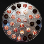
Currently the clade gift UI looks like this:

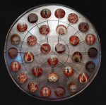
If you couldn't tell, these are the gifts I have selected:
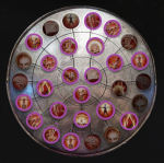
In case you were wondering, this selection results in 197 health and 409 stamina. The most optimal configuration I have found so far.
I propose an increase in contrast between the unselected clade gifts, and the selected ones.
I also propose a more distinct highlighting of the channels connecting chosen clade gifts.
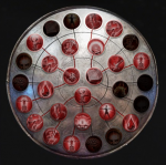
Something like this:
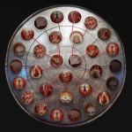
but obviously done with more precision and effort than one minute in ms paint.
What else do you think could be improved upon for the clade gift UI?
Thank you for reading, and have a wonderful day.
The clade gift UI suffers from a fatal lack of contrast at the moment, making it very difficult to see what gifts you have and haven't selected.
Currently the clade gift UI looks like this:

If you couldn't tell, these are the gifts I have selected:

In case you were wondering, this selection results in 197 health and 409 stamina. The most optimal configuration I have found so far.
I propose an increase in contrast between the unselected clade gifts, and the selected ones.
I also propose a more distinct highlighting of the channels connecting chosen clade gifts.
Something like this:

but obviously done with more precision and effort than one minute in ms paint.
What else do you think could be improved upon for the clade gift UI?
Thank you for reading, and have a wonderful day.

